Monday, May 31, 2010

Canadian HOUSE & HOME July 2010 - The Carter Farm

Now this is something that I've really, really been waiting for.  For the past 1 1/2 years I've been harassing poor Catherine MacIntosh at Canadian House and Home to try to grant me the prestigious posting of "Artist's File" within the magazine.  It is a feature that is not run every month, so you can well imagine that the competition for it is furious.


Late last spring when my parents were in the final stages of building their brand new farmhouse in Hockley Valley (one hour north of Toronto) I started thinking that CDN House and Home just HAD to use this place as one of their featured homes.  The magazine agreed with my idea and the farm was shot by Michael Graydon on September 1, 2009.  The issue hits newstands on June 7, 2010 but if you have a subscription, you may have seen it already.  We had the opportunity to have the article written by a very gifted writer, Trish Snyder.  Trish interviewed my parents and myself in order to get a feel for the home and the art within it.  I can't imagine a task as daunting as Trish's writing that article--sooo much information thrown at you all at once.  Her take on the farm was absolutely perfect and we couldn't be happier with her "story".

The farm is truly a magical place.  I really can't describe how tranquil and surreal it is.  After 20 years of fighting traffic en route to Muskoka, most of our family was ready for a big change.  Mum and Dad purchased a 100 acre parcel of property just north of Caledon and went to town.  The existing fly-ridden 125 year old farmhouse was gutted and redone and is now used to accommodate all the "kids" and 7 grandkids.  Mum and Dad have built a beautiful ranch-style farmhouse for themselves which overlooks...Tuscany?  How is that possible in Ontario?  I don't get it either...but you'd have to see the view to really believe it.  Here is the article:


Meg Crossley, the senior editor who attended the photo shoot along with photographer Michael Graydon, mentioned during the shoot that an even better way to gain exposure within the magazine is to be shown on the actual walls of a featured home.  Bing, bang, boom--whatever...this is my big shot!  Thankfully my parents are very enamored of my art and have commissioned several large pieces from me for their farm.  The work stands out so well against the starkness of the glistening white everywhere--I am very fortunate to be able to "show" my own work within their masterpiece.  Here are the paintings that Mum and Dad have at the farm:


The Garden
2008
acrylic on canvas
60"w x 48"h


Black and White Squares (#1)
acrylic on canvas
2008
60"w x 48"h


Bedtime Squares
acrylic on canvas
60"w x 36"h
2008


When You Are Old
2009
acrylic on canvas
24"w x 48"h

I can't wait to spend a ton of time at the "farm" this summer.  Wish you were there...

xx
Justine

June Show at Gallery Hittite in Yorkville

As you can see by my postings this week, there has been a heck of a lot going on with me and my own tiny art world over the past several months.  Thank you to all my amazing clients for keeping me so, so busy.  I have worked non-stop on commissions since October, not that I am complaining in any way shape or form.

I was invited by Gallery Hittite in Yorkville to take part in a small group show with them for the month of June 2010.  The opening night gala is on Thursday, June 3 from 7-10 and the show runs until June 26.  


Gallery Hittite
107 Scollard St., Toronto, Ontario, M5R 1G4
T: 416.924.4450
Hours: WED-SAT 12-6 p.m.

I will  be showing two pieces at the gallery.  They are:

Pixels
2010
acrylic on canvas
36" w x 48"  h

After Winter Must Come Spring
2010
acrylic on canvas
48" square

Hope to see you there!

xx
J


Monday, May 10, 2010

A Bunch of Reviews

I have been fortunate enough to have received several good reviews from different online publications over the past several years.  My little brother Ash submitted my work to the international art and design website Mocoloco.com early in 2007, unbeknownst to me (he didn't want me to be upset if they didn't chose to review my work).  Thankfully, Mocoloco did chose to review my work and they really liked it!  Here's the link to the review...mocoloco review .

When googling my name one day (I often do this...do you????), I came across a random review of my work on New Jersery based website Sweet Station.  Here's that review...sweet station review .

In January 2009 I received a "special honour" in the Upstream People Gallery's online art contest.   They submitted a press release to their local media....and here it is:

IMMEDIATE PRESS RELEASE
JUSTINE FERNIE RECEIVES SPECIAL INTERNATIONAL RECOGNITION
Artist JUSTINE FERNIE of TORONTO, ONTARIO, CANADA has received THREE Special Recognition Merit Awards for her artwork in the "6th Annual Color Juried Online International Art Exhibition” hosted by  Upstream People Gallery.

This international exhibition received approximately 400 entries from around the world and 74 artists were selected by the juror Larry Bradshaw, Professor of Art at the University of Nebraska at Omaha, U. S. A.

Professor Bradshaw states this about this specially recognized work:

"'JUSTINE FERNIE of Toronto, Ontario, Canada has a acrylic painting that is quite engaging in that it is very colorful and full of wonderful patterning, entitled “Bedtime Squares”. In a rather unusual treatment of colorfully patterned trees along a walkway to an elaborate cottage she presents “Carter Cottage”. And again she has a very strong and colorful work called “The Garden” in which the varied shapes and movement are delightful indeed."'

The exhibition will be featured online through February 28, 2009 at www.upstreampeoplegallery.com  and continue for 12 months, closing January 31, 2010.

Further information about the artist's work in her own words:

'"My piece "Bedtime Squares" is a large scale work created out of my love for colour.  The idea for my use of squares came from a small area created on a recent landscape painting.  I started wondering what it would be like to create entire canvases made up entirely of varying squares of all different colours. I have created several pieces with this in mind--some full of colour, some monochromatic and one even made up of all shades of black and white and whatever lies in between.

"Carter Cottage" is an architectural portrait of my parent's cottage on Lake Joseph, Muskoka, Ontario.  I painted the cottage first in colours closely matching the existing colours of the structure.  When it came time for the background and foreground I was not interested in recreating the natural vegetation of the actual landscape.  Instead, I created and doodled my way through a fantastic, vibrant and expressionistic landscape which served to ground the cottage.  My parents have since sold the cottage but the painting will serve to spark many memories of the actual experience.

Lastly, "The Garden" is a large scale acrylic on canvas work I created this past summer.  Going with a combination of the abstracted squares style of previous pieces and the foreground of the "Carter Cottage" piece, I used all of my very favourite colours at once.  The resulting organic shapes and textures within the painting are completely random.  I have been fascinated by hearing people's opinions of the work--flowers, butterflies, segments of human anatomy are a few of the comments it has received.  The piece actually brought a woman to tears at a recent show I brought it to.  As an artist, I attempt to illicit a response from the viewer, be it negative or positive.  Truly, the positive response that I have received from all three of these pieces has served to spur me on to push myself and to keep on creating.  I have always been fascinated by my own ability to emote through vibrant, revelatory colour.  It is not something that is predetermined by me when I sit down to paint--it literally just happens."'

Bedtime Squares
36" x 60"
acrylic on canvas

On September 22, 2009, I took part in the first ever "Art Beyond Walls"--an urban one night only event hosted by my gallery The Village Gallery.  The event took place at The Berkeley Field House and featured the work of Alison Hodson, Andrew King and myself.  It was a really, really amazing event!  There were over 250 people in attendance and the vibe was really exciting.  There was lots of media covering the event.  Fashion Television (FT) came with a cameraman and interviewed us.  Although they didn't actually run the footage, they did use the image of "Her Madgesty" in their commercial.  Also, industry publication BizBash came to ABW to interview Alison and here is the review...biz bash review of Art Beyond Walls .

Alison Hodson, Justine Fernie, Alison Goodwin and Andrew King
Art Beyond Walls - September 22, 2009


Alison and Megan of The Village Gallery

Website the remotestylist.com also came to Art Beyond Walls and offered the following review...the remote stylist review of Art Beyond Walls.

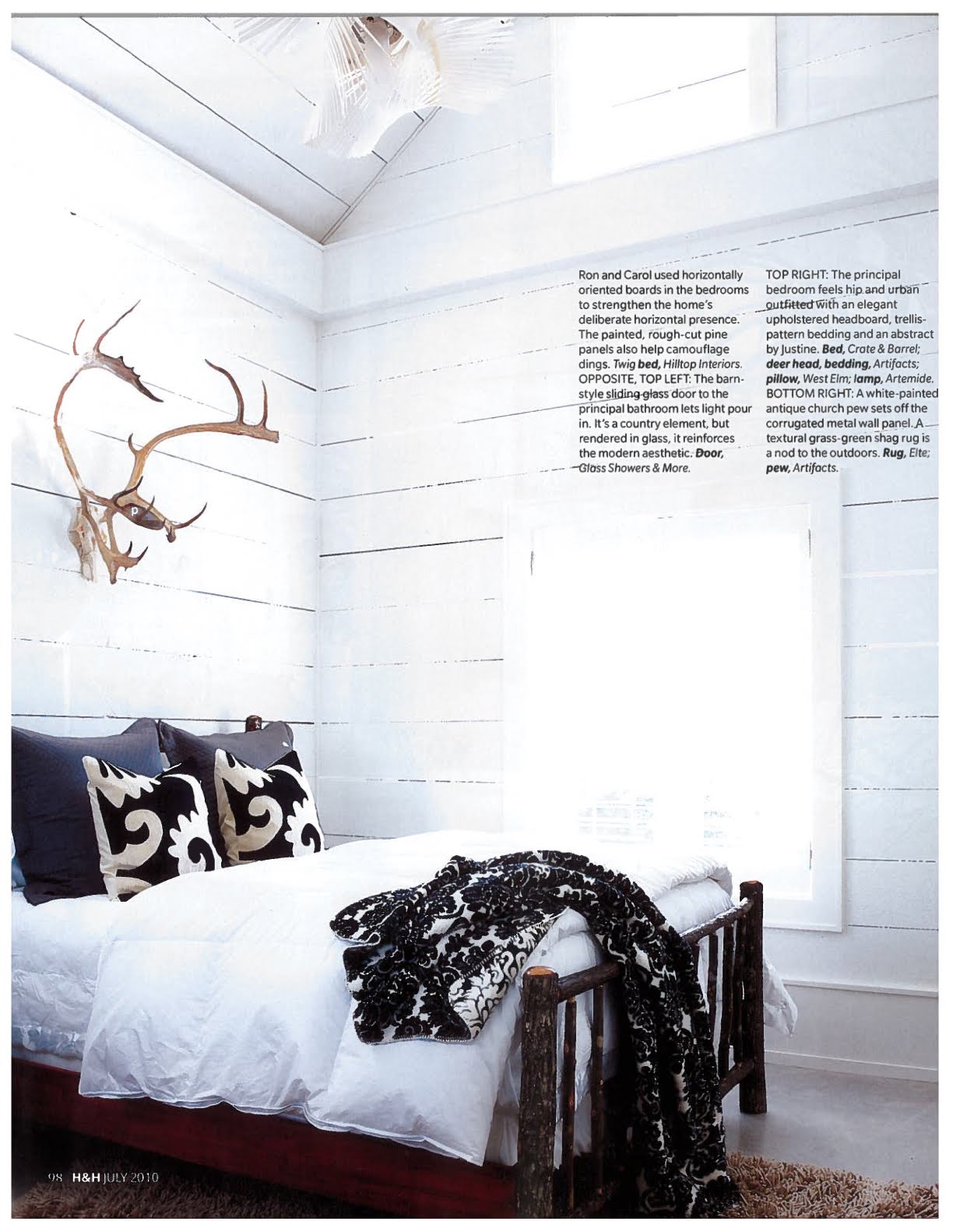
In January 2010, The Village Gallery took a couple of my paintings with them to take part of their booth at IDS (the Interior Design Show) in Toronto.  Alison Goodwin (the director/owner of The Village Gallery) said that sooooo many people recognized my painting "Her Madgesty" (of Madonna) in the booth, but weren't sure why they knew the piece.  I think probably the fact that the painting is FLASHED on a new commercial for Fashion Television touting me as "one of today's innovator's in art" (THANK YOU) is probably how the image has been seen by many people.

Alison Goodwin of The Village Gallery took "Her Madgesty" and "Oh Bama" with her to a television taping of "Breakfast Television" in October 2009.  Amazing exposure again...


Alison Goodwin and Dina on BT


I guess all of this amazing exposure Alison has given me over the past year has really started to pay off!!!  Internet magazine Alternavox.net came to IDS to review it and paid particular attention to my work.  Here's the review...alternavox review .

Alison and Megan of The Village Gallery at IDS 2010


On Saturday, March 27, the Village Gallery hosted a very, very special day for me entitled, "LIVE with Justine Fernie".  I spent the afternoon at the gallery surrounded by all the amazing staff and interns there and painted my little face off.  The event was covered by SNAP Mississauga and had many members of the community passing through to see how I create my work.  It was a really amazing experience for me.  The link to the SNAP Mississauga piece is...SNAP Mississauga article  .


This blog kind of acts as a live resume for my work.  An artist is always expected to list their reviews and shows at a moment's notice which is why I've chosen to list everything here on my blog.  I really don't have a swelled head about my accomplishments over the past couple of years.  Marketing myself as an artist is truly another full time job but I truly believe the best way to really sell myself, is by myself.  Of course I've had some great help along the way by my clients and believers too.

Enough about me, what do you think about me? (best line ever).  Sometimes I bore myself.

xx
J

Sunday, May 9, 2010

Happy Mother's Day

In honour of Mother's Day today (and my mother's birthday too), I thought I'd post a couple of paintings of  a few more great kids that I have painted.

The first two are of Ben and Erin Laco--beautiful kids.

Ben Laco
acrylic on canvas
16" square
2008


Erin Laco
acrylic on canvas
16" square
2008

I chose to paint Ben's little face with a brush and Erin with the palatte knife--not for any reason in particular.  Ben's eyes are painted in the icy blue that they are in reality.  I don't often chose to paint "realistic" eye colour, but in Ben's case the blue of his eyes is uncanny.  Come to think of it, that's also why I painted Erin's eyes the chocolate brown that they are too.  Instead of chosing a feature to exaggerate, sometimes I chose to focus in on a feature that truly stands out in a person and kind of defines who they are (not necessarily what they look like).

The next piece is a commission done for a dear friend of mine, Helen Charbonneau.  Helen has always been a huge supporter and fan of my artwork.  Helen asked to have me paint a portrait of her two beautiful boys, Tristan and Justin.

On the first day of Tristan's year in Junior Kindergarten (2004), the first little boy Tristan met was his alter-ego--Tristan Charbonneau.  Just when you think you are being original with your choice of names...!  Tristan and Tristan are still great friends 6 years later, so I have always felt a special bond with "the other Tristan".  Justin, Helen's younger son, is currently in a grade 1/2 split class with my daughter Carter.  Justin and Carter have also grown to be great friends--it still shocks me that they met when they weren't even 2 years old!


Tristan and Justin Charbonneau
acrylic on canvas
36" square
2010

I was dying to hear the boys' reaction to the piece--as well as that of their father Erik's opinion too, as Helen had the piece commissioned as a surprise for all three of her boys.  Their reactions were truly priceless.  Justin ran up to me in the playground and yelled, "I LOVE THE PAINTING JUSTINE", and proceeded to give me a huge hug.  Not to be outdone by his brother, Tristan told me how me he too loved the portrait...especially his hair.  I knew that if either boy didn't really like the piece that they really couldn't hide that fact from me.  

Thankfully,  ALL of Helen's boys (including Helen herself!) were thrilled with the project.

xx
J

Thursday, May 6, 2010

SNAP covers LIVE with Justine Fernie at The Village Gallery

This is an article written about my live show at The Village Gallery that took place on March 27, 2010.  Some of the fact are a little off (I've shown in Toronto, Los Angeles, Mississauga and soon to be Montreal too) but overall it's more great exposure, courtesy of Alison Goodwin at The Village Gallery (http://www.thevgallery.com).

Here's the piece:

SNAP South Mississauga - LIVE- with Justine Fernie


J

Tuesday, May 4, 2010

The "Merge"

My husband Sean should be credited for art directing one of my latest paintings.  Sean suggested that I merge my love of portraiture with my abstracted "squares" style in one single painting.  I liked the idea but going into it, I was a little confused as to how I would actually execute the concept.

I had already drawn a previous portrait of Barack Obama on a 3' x 4' canvas last year, but decided to go with a larger 4' x 5' canvas for the Oh Bama portrait.  I started this new portrait with the background first, which is usually where I start a figurative portrait.  The background of this piece is a series of squares of varying sizes using pinks and golds.  It was a good start.

Next I tackled his hair.  The background squares were mostly black--matte and shiny.  The overlapping squares were completely multi-coloured.  Still happy with it.

Creating the webwork of squares and patterning for Obama's face was kind of daunting.  I started drawing the outlines of sort of feather shapes all over his forehead in a multitude of colours.  I created the background squares of his mouth in shades of red and pink with multi-coloured squares over top.  Filling in the top layer of squares over his entire face was painstaking and very time consuming.  It's really difficult for me to judge the end result of "drawing with squares" while I am painting--I'm just too close to the physical canvas.

When I had finished the final layers of colour, I moved the painting and put it on the mantel and stood back.  Nope, it wasn't right.  The mouth, hair and background were too separate--it didn't read as one large piece but that of a piece made up of pieces.  Are you following me?

I realized that I had to do another layer of squares blending all the separate parts together.  Yes, that was it.  Now, while viewing the piece up close it just looks like another abstract piece.  The beauty of that piece is seeing it from a distance.  From a distance you can tell that it is a large face.  What kills me is that everyone who has seen it recognizes it as Obama.  Wow.  Pretty cool.  

Pixels
3'w x 4'h
acrylic on canvas
2010

I decided not to name the piece anything that would lead the viewer to think (or know) it was a portrait of Barack Obama.  Since the piece is made up of thousands of tiny pieces that make the portrait look "pixelated", I went with the name Pixels.

This piece and After Winter Must Come Spring will both be included in a group show to be held at Gallery Hittite on Scollard St. in Toronto for the month of June.  More on that later.

Thanks Sean...it was a great idea.  Personally, I think it's my best work to date.

xx
J